
How to apply Material theme colors for your Angular Component
TLDR; Create a @mixin to receive the $theme as a parameter, so that you can get the colors you need from the $theme and apply it to your css selectors. Then include the mixin into your styles.scss.
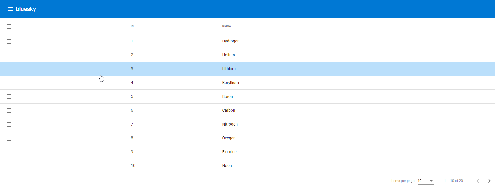
When you are using Angular Material components, the colors are usually chosen for you or like the MatToolbar, there is a color property for you to conveniently get the palette from your theme. However, there might be times when you need to add a color from your theme palette and that is not readily available. For example, adding a background color to a table row when your mouse is hovering over it.
.full-width-table {
  width: 100%;
}

.mat-row {
  cursor: pointer;
}

.mat-row:hover {
  background-color: beige;
}
Though we can easily add the .mat-row:hover css selector in the component’s css, we can’t really get the color we want from our theme. This beige color might fit your current theme, but if there is a dark theme selector in your template, you might want a different color based on the theme selected by the user. That makes the above simple approach not really effective.
To dynamically get the color from the theme, we will need to incorporate our css in a @mixin. A Mixin is essentially a function which returns a css style which you can use immediately in your scss with @include. It can accept parameters, so you can generate css styles dynamically with different parameter values. So we create a new color @mixin in our scss file to return the css for the .mat-row:hover, accepting a $theme as the parameter, which we can use later.
@mixin color($theme){
  .mat-row:hover {
    background-color: beige;
  }
}

.full-width-table {
  width: 100%;
}

.mat-row {
  cursor: pointer;
}
We can get the theme color configurations with the get-color-config($theme) function provided by angular material. And this function will return a sass map, where you can get the primary, accent, warn color palettes in the theme. To understand more about theming in angular material, do check out my previous post on Defining your own theme in Angular Material. A sass map is just like a map or dictionary in other programming languages. To get the value of a key in the sass map, we can just use the map.get($map, $key) method. As we are using the sass map and angular material, we’ll need to include them with the @use statement.
@use 'sass:map';
@use '@angular/material' as mat;

@mixin color($theme){
  // Get the color config from the theme.
  $color-config: mat.get-color-config($theme);

  // Get the primary color palette from the color-config.
  $primary-palette: map.get($color-config, 'primary');

  .mat-row:hover {
    background-color: mat.get-color-from-palette($primary-palette, 100);
  }
}

.full-width-table {
  width: 100%;
}

.mat-row {
  cursor: pointer;
}
However, as the .mat-row:hover is within a @mixin, it is not going to be implemented as the @mixin is like a function, if it is not called, it will not execute, so we have to include it in our styles.scss. But before that, let’s modularize the component css to separate out the function calls.
Our component style is originally just table.component.scss, we should extract the @mixin code into a partial sass file, so that the rest of the non mixin code will not be generated again in the styles.scss. By convention, the filename should be suffixed with -theme, and based on partial sass file convention, it should be prefixed with an underscore _. We should end up with 2 scss files - _table.component-theme.scss,
@use 'sass:map';
@use '@angular/material' as mat;

@mixin color($theme){
  // Get the color config from the theme.
  $color-config: mat.get-color-config($theme);

  // Get the primary color palette from the color-config.
  $primary-palette: map.get($color-config, 'primary');

  .mat-row:hover {
    background-color: mat.get-color-from-palette($primary-palette, 100);
  }
}
and table.component.scss.
.full-width-table {
  width: 100%;
}

.mat-row {
  cursor: pointer;
}
Lastly, we need to include our new partial sass file into our styles.scss. Note that we should omit the preceding underscore _ as well as the .scss extension. The following line will import our sass partial file and named it as table.
@use "./app/table/table.component-theme" as table;
Then, add the following line in your styles.scss right before the html, body css selector.
@include table.color($bluesky-theme);
We use
@useto import sass files, and@includeto include the mixin.
The table references the sass partial file, and the color is the @mixin we declared, and the $bluesky-theme is the theme we have in our styles.scss to be passed into the @mixin as a parameter.
That’s it.